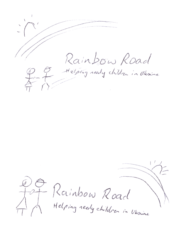
new logo
by astanga - uploaded on December 2, 2016, 12:59 pm
Hi Thanks to Jon Phillips for the contact. Sorry for the delay before my reply. You will see why with the scan that I enclose. To draw something myself literally makes me break out in a cold sweat, because I draw like a child... Anyway, to explain a bit more... I have created a basic web site for the newly founded charity, Rainbow Road, which is registered and operates in Ukraine to help needy children. This was a hastily created site (as is fairly obvious) and I am already creating version 2 which will be much nicer, more interactive, and actually (I hope) attract people to return often. Of course I need it to be attractive, because I want to attract donations - which are the lifeblood of any charitable work. The site can be found at https://rainbowroadukraine.org As you can see, I already have a logo, but a very basic one. However, it sums up what I want and need. I need something that is adaptable to different situations. It needs to stand at front top of the website, and similarly on official stationery. I also need to be able to take a square portion of it that can stand alone to act as that little logo you get in the tabs of web browsers - and that this section can also be used as a 'link button' on parts of the website. The logo needs to be adaptable to be used on business cards and other stationery. I enclose, in addition to my awful sketches, the logo that we presently have and the portion that is 'detachable' from it. lastly, I need the logo in 2 language - English and Ukrainian. In English, as with the present logo and my awful sketches, the main name is 'Rainbow Road' and the tag-line is 'helping needy children in Ukraine'. In Ukrainian, the main name is 'Райдужний ШлÑÑ…', and at the moment we do not want a tag-line in Ukrainian - maybe an underline instead. The main idea is that I would like 2 kids on one end or other of this. There needs to be something to symbolize the rainbow, of course, and I am not sure which end of the logo would be best for this. The kids could be stylized, but anyway a simple representation that can be adapted in the different ways I described (and can be identifiable in future as our 'image' with or without the name of the charity). Since sketching and while writing this, it occurs to me that it may even be more appropriate for one of the kids to be disabled - maybe a wheelchair user or with crutches - and being helped along the journey by the other kid. And I like the idea of a boy and a girl. How and where to represent the rainbow in all of this I am not sure. With the original logo, as already exists, I have the kids on a crossing and, in my mind at least, the Rainbow Road words and the underline kinda extends the road. So maybe some conveying of the idea of going along the road towards a better life...? My colleagues would like something that, for the top centre of the website at least, is more colourful without looking 'childish' or 'Playschool' if that makes sense... And that would also work with different colour combinations to portray different moods perhaps. And of course a subset or simplification that works for monochrome printing. It is only now, having started down this road and actually doing the work, that I realised just how adaptable a logo needs to be for many different uses and situations... Apologies for the length of this email, but thought I would simply lay it all down as it is.. With thanks in advance, Andris Stanga
Log into OpenClipart
- Tags
- upload2openclipart logo road would need needs kids which rainbow have adaptable request+completed filter+autotrace vectorized
- Safe for Work?
- Yes
1 Comments. Please login to comment or add your own remix.